笛里谁知壮士心,沙头空照征人骨。这篇文章主要讲述Flutter 专题61 图解基本 Button 按钮小结#yyds干货盘点#相关的知识,希望能为你提供帮助。
Button 在日常中是必不可少的,小菜尝试过不同类型的 Button,也根据需求自定义过,今天小菜系统的学习一下最基本的 Button;
Flutter 中没有 Button Widget,但提供了很多不同类型的 Child Button Widget;小菜分析源码整体可分为 RawMaterialButton 和 IconButton 两类;
其中 RaisedButton / FlatButton / OutlineButton 继承自 MaterialButton 且 MaterialButton 是对 RawMaterialButton 的封装;而BackButton / CloseButton / PopupMenuButton继承自 IconButton;最终 RawMaterialButton 和 IconButton 都是由 ConstrainedBox 填充绘制;

文章图片
IconButton 系列
IconButton 系列属于图标按钮,使用相对简单;其核心是 InkResponse 水波纹效果;
IconButton 源码分析
const IconButton(
Key key,
this.iconSize = 24.0,// 图标大小
this.padding = const EdgeInsets.all(8.0),// 图标周围间距
this.alignment = Alignment.center,// 图标位置
@required this.icon,// 图标资源
this.color,// 图标颜色
this.highlightColor,// 点击高亮颜色
this.splashColor,// 水波纹颜色
this.disabledColor,// 不可点击时高亮颜色
@required this.onPressed,
this.tooltip// 长按提示
)
分析源码,其中 icon 和 onPressed 是必须要设置的,其余属性根据需求而适当调整;
案例尝试
- 小菜首先尝试最基本的 IconButton;长按会由 tooltip 提醒,点击为默认主题色;
IconButton(icon: Icon(Icons.android), tooltip: IconButton tootip1,
onPressed: () =>
 Toast.show(IconButton, context, duration: Toast.LENGTH_SHORT, gravity: Toast.BOTTOM));
- 小菜尝试其中几个属性;其中 icon 颜色为 cyan,点击高亮背景色为 deepPurple,水波纹颜色为 redAccent;注意当 icon 自身设置颜色时 color 属性不生效;
IconButton(icon: Icon(Icons.android), tooltip: IconButton tootip2,
color: Colors.cyan,
highlightColor: Colors.deepPurple.withOpacity(0.4),
splashColor: Colors.redAccent,
onPressed: () =>
 Toast.show(IconButton, context, duration: Toast.LENGTH_SHORT, gravity: Toast.BOTTOM));
- 小菜尝试不可点击时,icon 颜色为 disabledColor 设置的 green;同样若 icon 本身设置了颜色,disabledColor 不生效;注意:onPressed: null 与 onPressed: ()=>
null 不同,前者代表无点击事件;后者代表有点击事件,只是点击无操作;
IconButton(icon: Icon(Icons.android), disabledColor: Colors.green, onPressed: null);
- icon 为 Widget 采用 Icon / Image / ImageIcon 等均可;
IconButton(icon: Image.asset(images/ic_launcher.png), iconSize: 40.0, onPressed: null);

文章图片
源码分析
const BackButton( Key key, this.color )分析源码,BackButton 继承自 IconButton,只允许设置图标颜色,图标样式 Android 与 iOS 不同且不可修改;点击时会优先判断 maybePop 是否可以返回上一页;
案例尝试
BackButton();

BackButton(color: Colors.green);
CloseButton【Flutter 专题61 图解基本 Button 按钮小结#yyds干货盘点#】 CloseButton 一般用作导航栏关闭按钮与 BackButton 类似;
源码分析
const CloseButton( Key key ) : super(key: key);
分析源码,CloseButton 继承自 IconButton,无需设置任何属性;点击时会优先判断 maybePop 是否可以返回上一页;
案例尝试
CloseButton();

文章图片
RawMaterialButton 系列
RawMaterialButton RawMaterialButton 是 MaterialButton 的基础,核心是由 Material 和 InkWell 等组成;但不可用当前 Theme 或 ButtonTheme 来计算未指定参数的默认值;
源码分析
const RawMaterialButton(
Key key,
@required this.onPressed,
this.onHighlightChanged,// 高亮变化的回调
this.textStyle,// 文字属性
this.fillColor,// 填充颜色
this.highlightColor,// 背景高亮颜色
this.splashColor,// 水波纹颜色
this.elevation = 2.0,// 阴影
this.highlightElevation = 8.0,// 高亮时阴影
this.disabledElevation = 0.0,// 不可点击时阴影
this.padding = EdgeInsets.zero,// 内容周围边距
this.constraints = const BoxConstraints(minWidth: 88.0, minHeight: 36.0),// 默认按钮尺寸
this.shape = const RoundedRectangleBorder(),// 形状样式
this.animationDuration = kThemeChangeDuration,// 动画效果持续时长
this.clipBehavior = Clip.none,// 抗锯齿剪切效果
MaterialTapTargetSize materialTapTargetSize,// 点击目标的最小尺寸
this.child,
)
分析源码可知,RawMaterialButton 没有设置宽高的属性,可根据 padding 或外层依赖 Container 适当调整位置和大小;默认最小尺寸为 *88px 36px**;
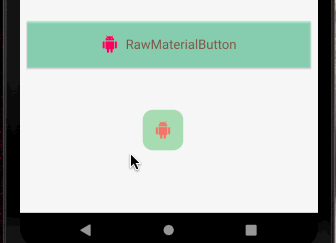
案例尝试 小菜定义了一个基本的按钮,并监听其高亮改变时状态,与我们常见的按钮基本一致;
RawMaterialButton(
padding: EdgeInsets.all(20.0),
child: Row(mainAxisSize: MainAxisSize.min, children: <
Widget>
[
Padding(child: Icon(Icons.android), padding: EdgeInsets.only(right: 10.0)),
Text(RawMaterialButton, style: TextStyle(color: Colors.brown))
]),
textStyle: TextStyle(color: Colors.pink, fontSize: 18.0),
fillColor: Colors.greenAccent.withOpacity(0.4),
highlightColor: Colors.cyan,
splashColor: Colors.deepPurple.withOpacity(0.4),
onPressed: () =>
 Toast.show(RawMaterialButton, context, duration: Toast.LENGTH_SHORT, gravity: Toast.BOTTOM),
onHighlightChanged: (state) =>
 Toast.show(onHighlightChanged ->
 $state, context, duration: Toast.LENGTH_SHORT, gravity: Toast.CENTER))
文章图片
FloatingActionButton FloatingActionButton 是 RawMaterialButton 的封装,主要用于浮动在屏幕内容之上,一般是位于底部左右角或中间;一般一个页面只有一个;
源码分析
const FloatingActionButton(
Key key,
this.child,
this.tooltip,// 长按提醒
this.foregroundColor,// 按钮上子元素颜色
this.backgroundColor,// 背景色
this.heroTag = const _DefaultHeroTag(), // Hero 动画标签
this.elevation = 6.0,// 阴影
this.highlightElevation = 12.0,// 高亮时阴影
@required this.onPressed,
this.mini = false,// 尺寸大小,分为 mini 和 default
this.shape = const CircleBorder(),// 样式形状
this.clipBehavior = Clip.none,// 抗锯齿剪切效果
this.materialTapTargetSize,// 点击目标的最小尺寸
this.isExtended = false,// 是否采用 .extended 方式
)
案例尝试
- 小菜尝试一个基本的 FloatingActionButton;长按会有 tooltip 提示;
floatingActionButton: FloatingActionButton(child: Icon(Icons.android), tooltip: FloatingActionButton ToolTip,
onPressed: () =>
 Toast.show(FloatingActionButton, context, duration: Toast.LENGTH_SHORT, gravity: Toast.BOTTOM));

文章图片
- foregroundColor 为按钮上层子元素颜色,若子元素本身设置颜色则不生效;backgroundColor 为按钮背景色;
foregroundColor: Colors.redAccent.withOpacity(0.7),
backgroundColor: Colors.green.withOpacity(0.4),

文章图片
- elevation 按钮默认阴影高度,即 z轴高度;highlightElevation 为点击高亮时阴影高度;
elevation: 0.0,
highlightElevation: 10.0,

文章图片
- mini 是否展示成小尺寸模式;materialTapTargetSize 为配置目标的最小点击尺寸,padded 为默认的 *48px 48px 为 Android 推荐尺寸;shrinkWrap 为缩小到 Material** 提供的最小尺寸;
mini: true,
materialTapTargetSize: MaterialTapTargetSize.shrinkWrap,

文章图片
- shape 为样式尺寸;clipBehavior 为抗锯齿效果;
shape: RoundedRectangleBorder(borderRadius: BorderRadius.all(Radius.circular(14.0))),
clipBehavior: Clip.antiAlias,

文章图片
- heroTag 动画标签,默认的是 FloatingActionButtonAnimator.scaling;且 heroTag 默认是相同的,可以自定义为唯一标签;小菜设置上一页面与当前页面 FloatingActionButton 的 heroTag 相同;
floatingActionButtonAnimator: MyAnimation(),
class MyAnimation extends FloatingActionButtonAnimator
double _x, _y;
@override
Offset getOffset(Offset begin, Offset end, double progress)
_x = begin.dx + (end.dx - begin.dx) progress;
_y = begin.dy + (end.dy - begin.dy) progress;
return Offset(_x 0.5, _y 0.9);
@override
Animation< double> getRotationAnimation(Animation< double> parent)
return Tween< double> (begin: 1.0, end: 1.0).animate(parent);
@override
Animation< double> getScaleAnimation(Animation< double> parent)
return Tween< double> (begin: 1.0, end: 1.0).animate(parent);
7. **FloatingActionButton** 提供了 **.extended** 方式创建代表标签样式的,非正方形的按钮样式;其余属性无差;floatingActionButton: FloatingActionButton.extended(
onPressed: () => Toast.show(FloatingActionButton.extended, context, duration: Toast.LENGTH_SHORT, gravity: Toast.BOTTOM),
icon: Icon(Icons.android),
label: Text(Android));
8. 针对特殊的个性化,**FloatingActionButton** 展示的大小可能会有所不同;小菜尝试了几种方式;
a. 通过最基本的 **RawMaterialButton** 实现 **FloatingActionButton** 样式,外层添加 **Container** 约束大小;小菜比较推荐方式一,灵活性更高;// 方式一
floatingActionButton: Container(
width: 100.0, height: 100.0,
color: Colors.greenAccent.withOpacity(0.4),
child: RawMaterialButton(
shape: CircleBorder(),
elevation: 0.0,
child: Icon(Icons.android),
onPressed: () ))
b. 借助 **FittedBox** 将按钮整体放大到 **Container** 约束范围内;// 方式二
floatingActionButton: Container(
width: 100.0, height: 100.0,
child: FittedBox(
child: FloatingActionButton(child: Icon(Icons.android), onPressed: () )))
c. **SizeBox** 与 **FittedBox** 约束方式不同,只是整体范围变大,其内部按钮按 **Material** 建议样式展示;// 方式三
floatingActionButton: SizedBox(
width: 100.0, height: 100.0,
child: FloatingActionButton(child: Icon(Icons.android), onPressed: () ))
d. **scale** 与 **FittedBox** 类似,按比例缩放;// 方式四
floatingActionButton: Transform.scale(
scale: 1.5,
child: FloatingActionButton(child: Icon(Icons.android), onPressed: () ))

***
&
nbsp;
&
nbsp;
&
nbsp;
&
nbsp;
&
nbsp;
&
nbsp;
**Button** 涉及的内容较多,扩展性很强,小菜分两节进行学习尝试;有些理解可能还不到位,有问题请多多指导!>
来源: 阿策小和尚推荐阅读


- Centos7安装JDK和Tomcat详细步骤
- Centos 7使用MyCat搭建 MySQL-读写分离
- Linux中卸载提示设备正忙怎么办?
- 「2022」打算跳槽涨薪,必问面试题及答案 -- ECMAScript 篇#yyds干货盘点#
- SpringBoot+Uniapp实战开发全新仿抖音短视频App
- 记一次文件编码格式导致命令执行不成功的错误--服务 tomcat 不支持 chkconfig
- 基于深度卷积神经网络的目标检测研究综述
- struts2中Action的三种开发编写形式,ActionSupport,POJO
- MacBook将大文件分割成很多个小文件split命